
Our kind
of play.
A guide to how Flownauts looks,
speaks and shows up in the world.
Brand GuidelinesA guide to how Flownauts looks,
speaks and shows up in the world.
A practical reference for the people who write, design and make things for Flownauts.
© 2026 Flownauts LLC. All rights reserved.
Flownauts is a trademark of Flownauts LLC.
FlowAccount and FlowPass are service marks of Flownauts LLC.
All other trademarks and service marks are the property of their respective owners.
Puzzles, pocket worlds,
and happy little detours.
“Flownauts is an independent game studio. We make room for curiosity: a small challenge, a satisfying discovery, a world worth returning to.”
Our audience is a person with a moment to play. Speak to their curiosity and agency, without assuming their age, skill or available time.
Four principles turn a visual identity into a recognizable experience.
Leave space on the page. Leave choice with the player.
An invitation can be quiet. Avoid pressure, countdowns and a screen full of competing requests.
Show a world. Give curiosity somewhere to go.
Use real game detail, distinctive materials and a specific idea. One memorable detail is enough.
A clear instruction. A well-placed piece of type.
Make the next step obvious. Every label, edge and line break should feel considered.
Say what is true. Make it easy to decide.
Never invent availability, prices, player counts, benefits or urgency to make an example persuasive.
Give each message a role. Our name and brand line stay steady; campaign headlines can play.
The connected teal lettering brings movement and a human touch. Its curves belong to the artwork, not to a typeface.
The solid, distinct “nauts” letters give the mark its steadiness. Preserve the exact transition between the two halves.
Use the supplied outlined SVG. Never rebuild the wordmark by typing “flownauts”, tracing a screenshot or generating replacement lettering.
Choose the artwork that belongs on the surface. Keep both halves easy to read.


Use the supplied “fn” monogram for favicons and constrained avatars. In unfamiliar contexts, include the full Flownauts name nearby.
All full wordmarks share the same geometry. Use the supplied single-color master when the process allows only one ink or thread.
Keep the supplied geometry intact. Scale the artwork as one complete mark.
1820 × 400 units
Ratio 4.55 : 1. At 100 mm wide, the canvas is 21.978 mm high. Keep its transparent padding.
w–n: 12 · s–™: 16
Horizontal gaps between outline bounds. At 100 mm canvas width: 0.659 mm and 0.879 mm.
94.651 × 52 units
Top-left (1686, 94), from the SVG origin. Align the top of ™ with the top of the “t”.
x = H ÷ 4 = 100
Leave x beyond every canvas edge. At 100 mm wide, that’s 5.495 mm on each side.
Use the supplied SVG; do not rebuild the mark. ViewBox: −20 −20 1820 400. Measurements describe the supplied master.
Recommended starting sizes. The production method and a real-size proof decide the final minimum.

Use rounded favicons for browser tabs. Use full-bleed for square or touch icons, and the separate maskable set for app launchers. Check at native size.
On a production sample at finished size, the “l” loop must stay open and distinct; “w” and “n” must stay separate; and ™ must read as two letters. All strokes must remain intact. If details fill in or merge, enlarge or change process.
16 · 32 · 48 · 96 · 180 · 192 · 256 · 300 · 512 · 1024 px
Both treatments in PNG, plus SVG masters and ICOs. Maskable: 192 / 512 px.
The illustrations on this page are a size comparison. The PDF is a presentation document, not an actual-size production gauge.
The examples below show treatments to avoid.
Also avoid cropping, separating the two halves, changing the trademark, adding a slogan inside the artwork, or placing a hole or stitch line through it.
Flownauts is the masterbrand. Product names and game identities have specific jobs.
The studio. Lead company communication, clothing and brand-led merchandise with Flownauts.

The account. Identify account services clearly. Account and security messages use the same plain, calm voice.
The membership. Use the supplied product wordmark where the subject is FlowPass. Only describe benefits and availability verified for that surface.
Each game can keep its own world, palette and character. A studio endorsement should not flatten those identities into one teal template.
For use in text, keep names consistent and apply the right symbol.
We’re Flownauts™.
Games you’ll love getting lost in.
Sign in to your FlowAccount™
when you’re ready.
Meet FlowPass™.
Make room for a little play.
Mark the first or most prominent mention on a surface. Repeated mentions on that surface do not need another symbol.
Flownauts, FlowAccount and FlowPass. Use ordinary capitalization in prose; the lowercase artwork remains an asset.
In text, FlowAccount and FlowPass use ℠ when the font supports it; otherwise use ™. Never fake a superscript “SM” in text.
Never use ® unless registration has been confirmed. Do not add symbols to URLs, code, filenames, email addresses or “Flownauts LLC”. Leave supplied logo artwork intact. Confirm current legal status before a new production run.
Flownauts Teal
#08576D
Warm Paper
#FAF7F0
Ink
#232020
Aqua
#8ACEDF
Flownauts Teal leads. Warm Paper gives it space. Ink adds clarity. Aqua brings a little joy.
Use Night #142F3A for dark backgrounds and Logo Ivory #FBF7EE for inverse artwork. Keep Logo Ivory distinct from Warm Paper #FAF7F0.
Pantone comparisons across the full palette. Use the specified library when reviewing physical chips.
| Flownauts color | Digital target | Pantone reference | Color library |
|---|---|---|---|
| Flownauts Teal | #08576D | 7708 C | Solid Coated |
| Warm Paper | #FAF7F0 | 9060 C | Pastels & Neons Coated |
| Ink | #232020 | Neutral Black C | Solid Coated |
| Aqua | #8ACEDF | 636 C | Solid Coated |
| Night | #142F3A | 547 C | Solid Coated |
| Logo Ivory | #FBF7EE | 9060 C | Pastels & Neons Coated |
| Soft blue | #DCEBEF | 656 C | Solid Coated |
| Muted ink | #62635C | 417 C | Solid Coated |
Physical approval pending. Warm Paper and Logo Ivory share 9060 C as a starting comparison; their digital values remain distinct. Approve a sample for each material and process.
Use these tested sRGB pairings. A quiet palette should still be easy to read.
| Foreground / background | Ratio | Body text |
|---|---|---|
| Muted ink / Warm Paper | 5.67 | Pass |
| Ivory / Night | 13.12 | Pass |
| Aqua / Warm Paper | 1.64 | Avoid |
| Fine line / Warm Paper | 1.35 | Not text |
Ratios calculated from the exact colors in this guide. Use 4.5:1 for normal text and 3:1 for large text. “Large” means at least 24 CSS px regular, or about 18.7 px bold.
More than color. Pair states with words, icons or patterns. A red/green distinction must never be the only way to understand a board or message.
Re-test the actual surface. Opacity, images, dark-mode tokens and substrate can change the result. These numbers are screen contrast, not a print-proof guarantee.
Our display voice. Use for headlines, titles and short statements.
Our reading voice. Use for paragraphs, navigation, instructions and captions.
A quieter shift in tone for quotations and personal observations. Keep headlines in Rubik.
A little logic.
A little sunshine.
Use sentence case and left alignment. Begin with a 68ch reading measure, generous line spacing and a clear break between thoughts.
Use real variable weights. Do not squash letters, fake italic or outline body text. Keep the logo as artwork. Use tabular numerals when values need to align.
Use Noto Sans CJK SC for Simplified Chinese, TC for Traditional Chinese, JP for Japanese and KR for Korean. Use Noto Sans for Greek. Match the role and weight; let each script set its own line spacing.
Rubik and Nunito Sans are supplied with their SIL Open Font licenses. Full script-companion families are linked in the kit; have a native reader review line breaks and punctuation.
A few clear steps. Space that belongs to the sentence. No need to make every line loud.
Follow your
curiosity.
Puzzles and pocket worlds. Find a new challenge, make a discovery, come back for another.
Illustrative brand copy and layout.
Rubik 550–600 · 56–80 px
Line height 1.05–1.12 · tracking −0.035 em
Rubik 550–600 · 28–40 px
Line height 1.12–1.2 · tracking −0.02 em
Nunito Sans 400–600 · 17–20 px
Line height 1.45–1.6 · normal tracking
Nunito Sans 600–800 · 15–17 px
Line height 1.4–1.5 · keep contrast strong
On screen, use these four levels. On paper, preserve their relative emphasis and check readability at the finished size.
One thought. A little room.
One main message per composition. Give the game, product or story the largest useful space.
Align the headline, description and next step to one edge. Let artwork occupy its own field; keep its edges clear of text.
Use our counters and arcs for studio stories. For a game story, give the game’s own board, palette and lettering the lead.
The studio frame uses an 8 px spacing rhythm and a 5% inset on 16:9 compositions. Keep one continuous area of Warm Paper around the message.
Counters, quarter circles and arches make the studio recognizable without borrowing a game’s identity.
Begin with a square. The circle fills it, the quarter circle shares its radius, and the arch has an opening half its width. Use an 8% module gap.
Rotate geometric pieces in 90° steps. Keep their proportions. Cards may tilt and overlap; keep every word readable and the logo level.
Use Teal as the anchor, Aqua for contrast and Ink sparingly. Keep shapes in an image field or a margin, clear of text and logo clear space.
For game-led work, use the game’s artwork. The studio shapes belong in the surrounding frame, an introduction or an end card.
Share the pleasure of noticing: a satisfying fit, a surprising route, a neat solution. Celebrate what the player did.
Lead with the action or discovery. Let a short, specific observation carry the personality.
Use concrete words. “That last piece found its home” earns its charm; repeating “little”, “moment” or “detour” does not.
The personality stays consistent. The amount of warmth, detail and playfulness changes with the moment.
| Moment | How to sound | Illustrative copy |
|---|---|---|
| Welcome | Open, lightly playful | There’s more than one way in. |
| Instruction | Direct, concrete | Connect the matching dots without crossing a line. |
| Success | Warm, understated | Every piece in its place. Nicely done! |
| Retry | Patient, neutral | Try another route. |
| Error | Calm, useful | We couldn’t save your changes. Try again. |
| Support | Attentive, specific | Thanks for letting us know. Tell us which game you were playing. |
| Payment / privacy | Precise, unambiguous | Show the actual price, terms and choice in plain language. |
Let delight follow the player’s achievement. Keep errors, payments and privacy calm and literal.
Explore the games
See what fits
Explore
Daylight Sudoku
One gap.
A new way in.
Your progress is saved on this device.
An unsupported superlative is still a claim.
Use sentence case. An occasional exclamation can celebrate something earned. Avoid pressure and inflated claims. Explain the intent of wordplay so translators can recreate it.
Show a real game mechanic, an intentional material or a character with a reason to be there.
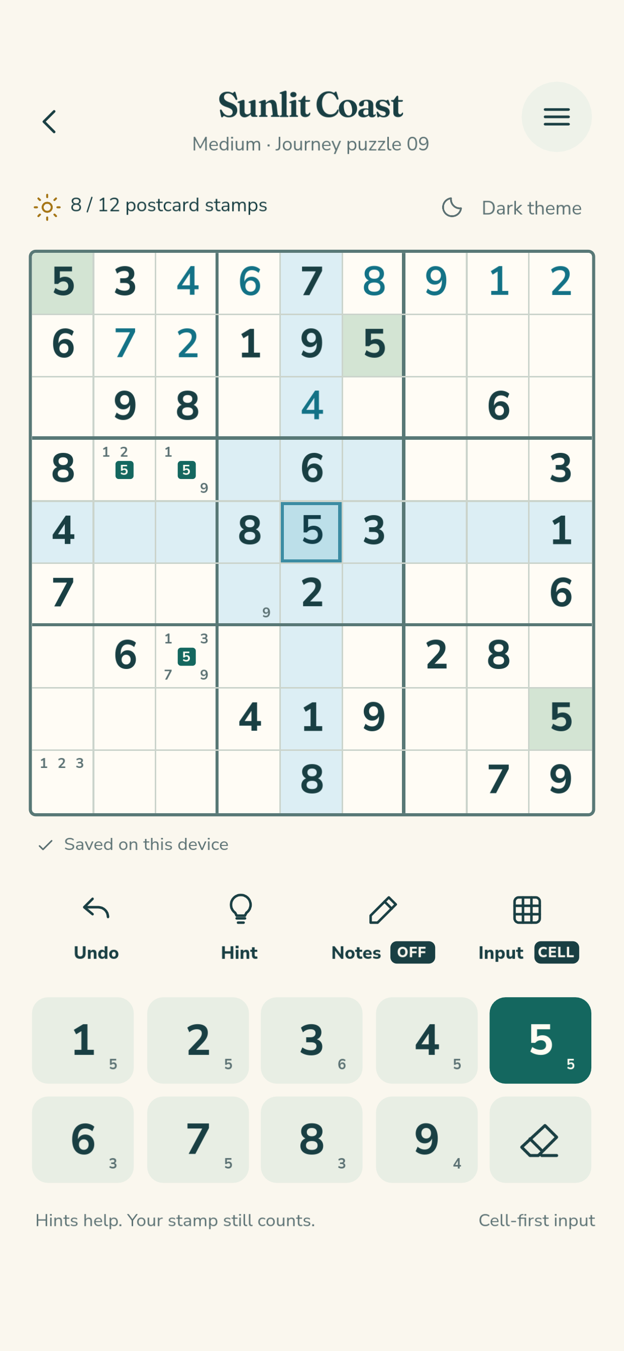
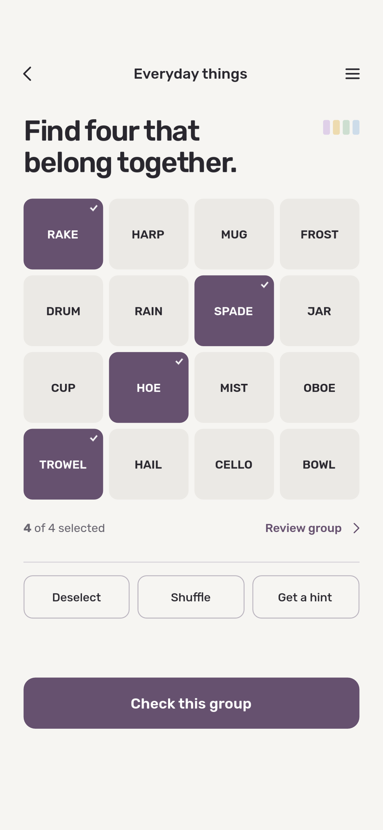
Use current, representative screenshots. Keep the board readable and preserve each game’s own palette.
Prefer believable light, natural material and an uncluttered setting. Keep color edits faithful to the actual product.
Identify concept images as concepts. Keep the intended material, color and proportions believable.
Use the website’s Lucide icons for studio interfaces: 24 px grid, 2 px strokes and rounded ends. Pair unfamiliar actions with a label. Each game can retain its own icon system.
A small movement.
A clear relationship.
Motion can connect a move to its result, reveal a new state or celebrate gently. Keep essential content visible from the start.
For interface transitions, begin around 160–240 ms and adjust to the task. Honor reduced-motion settings; use an immediate state change instead.
Daylight Sudoku leads. The Flownauts frame connects the feature, newsletter and social formats.
Daylight Sudoku
A fresh view of a familiar puzzle.
Explore Daylight SudokuDaylight Sudoku
A fresh view of a familiar puzzle.
Explore Daylight SudokuApplication studies use actual gameplay imagery. Publication copy must describe current availability and confirmed product behavior.
Flownauts is the maker. Give the game its own name, color and atmosphere, with a clear studio endorsement.
Daylight Sudoku
A game by
Games you’ll love
getting lost in.
Keep the marks separate. Do not rebuild a game title in the Flownauts wordmark style or recolor gameplay to match the studio palette.
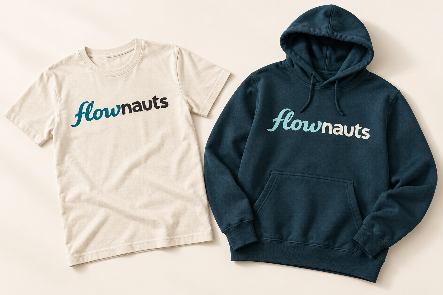
Begin with the garment, its construction and the decoration process. Then size the artwork.
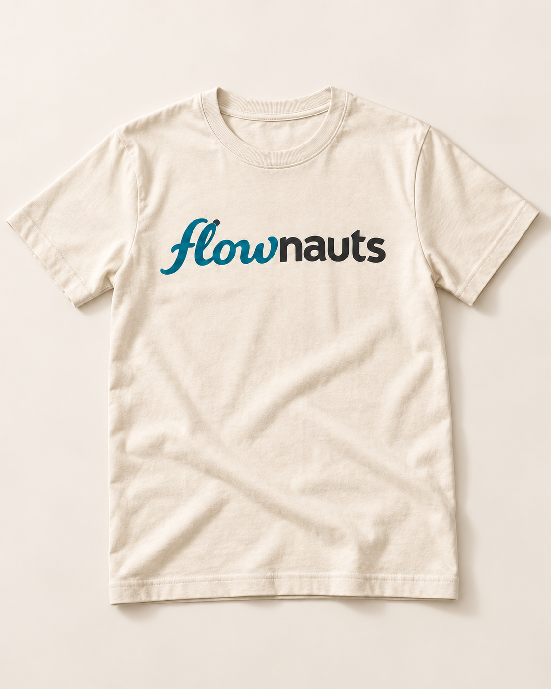
Use the full master for a chest print. Keep it level and away from seams, pockets and folds that interrupt the mark.
Concept placement · a quiet chest mark, clear of the collar and seams.
Make the wordmark feel intentional on the garment. Use generous breathing room and check the visible mark when the item is worn.
Use the primary wordmark when two colors reproduce clearly. Use the supplied single-color master for a quieter finish or a one-color process.
The loop in “l”, the gap between “w” and “n” and both letters of TM must remain distinct. Enlarge the mark or choose another process if they close up.
Warm materials, confident color and room to breathe.
A little room
to play.
Prefer warm-white, uncoated or matte paper. Let the stock’s natural color provide Warm Paper where possible; compare the finished piece with the palette.
Let Flownauts Teal lead, balanced with generous Warm Paper. Use Ink for reading and Aqua for a small moment of joy.
A tactile detail can reward a closer look. Keep foil, embossing and varnish subtle, with lettering clear and the wordmark intact.
Across postcards, inserts and packaging, aim for something considered, welcoming and worth keeping.
The goods carry Flownauts.
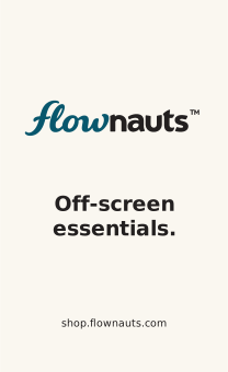
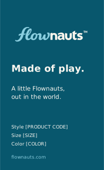
Warm uncoated stock, soft corners and a simple cord. Keep the front for the identity; let the reverse carry product information.
Tag and label illustrations show the intended appearance. Production artwork requires verified product content and a physical sample.
Keep brand, size and care information legible. Reserve the parts that will disappear into a seam.


Keep the full identity within the 50 mm visible face. The folded ends sit outside the artwork.
Keep the size centered in the visible tab, with 5 mm at the top reserved for the seam.
Choose the finish that keeps the lettering distinct, the edges soft and the label comfortable against skin.
Care and identity information belongs on a durable label, with room for verified content.
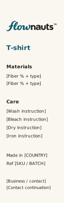
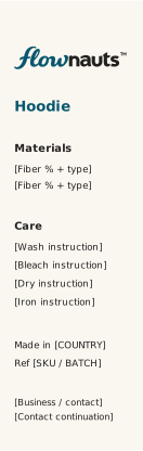
Keep the top 8 mm clear for the seam. Use a durable, high-contrast print; product composition and care instructions must remain readable throughout the item’s life.
Partner name
Illustrative relationship only · no partnership implied
Balance optical weight rather than matching bounding-box height. Keep each mark’s clear space and use a neutral field.
Say “Supported by”, “Available on” or another accurate description. Never make an endorsement or affiliation look broader than it is.
Use current partner assets and permission terms. Do not merge paths, recolor a partner mark or build an improvised hybrid logo.
Apply these spacing and relationship rules to co-branded work. Clearly identify paid or sponsored material.
#08576D · #FAF7F0 · #232020 · #8ACEDF
Rubik for the headline.
Nunito Sans for the reading.
Nunito Sans italic for a personal note.
Use real artwork, warm space, clear hierarchy and a specific piece of play. Preserve each game’s world.
Warm, brief, plain. Notice something specific. Celebrate earned progress. Leave pressure and inflated claims behind.
Choose materials and finishes that feel considered, welcoming and made to last.
A recognizable identity is made through repetition.
A loved one is made through care.
Flownauts Brand Guidelines · Edition 1.1 · 8 October 2026
© 2026 Flownauts LLC. All rights reserved.
Recompose. Keep the story.
Daylight Sudoku
A little logic.
A little sunshine.
Daylight Sudoku
A little logic.
A little sunshine.
Keep the anchor
Use the same game title, headline and board. Preserve the game colors; let Warm Paper frame them.
Move with the format
Keep an 8% inset for essential content. Adjust the board size and logo position to fit; never stretch the composition.
Make the destination clear
Put the descriptive link in the accompanying post. Use captions and alt text to carry meaning beyond the image.